Tuesday Google announced a New Charts Editor in Google Docs. This is important because Google continues to improve it's spreadsheet offering in the cloud. And while in my opinion, Excel will always be the king of spreadsheets, Microsoft has to be aware that many younger people may very well use spreadsheets in Google Docs because it's free. Hence, a new generation of people that may grow up without Excel.
There's a short video on the Google Docs Blog about the new Charts Editor in Google Docs. They also show a few screen shots of some, but not all of the chart offerings.
- Org Chart
- Annotated Time Line
- Motion Chart
- Line Chart
- Pie Chart
- Column Chart
- Scatter Chart
- Sparkline
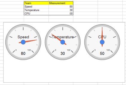
- Gauge
The Sparkline chart isn't shown in the blog article, but you can give the new charts editor a try at goo.gl/newcharts. I think their Sparkline charts are kind of big and bulky, but that's just me.
However, I kind of like the Gauge chart.
Let me know what you think.