Each week I download the over-under calories report from Lose It! and dump the data into a spreadsheet. I just created my first Sparkline graphic to show the last 7 days of this data.
For this example I'll use an OFFSET Function inside a named range, which was created in my last couple of posts.
A Little Prep Work for a Dynamic Range
In this post I'll use the formula:
=OFFSET(Sheet1!$B$1,COUNTA(Sheet1!$B:$B)-7,0,7)
inside the named range: LastSeven, which will return the last 7 data points of column B data, dynamically. As I add more data, the range reference always returns the last 7 data points.
Sparklines are New in Excel 2010
Keep in mind that older versions of Excel won't be able to see Sparklines, because they're new in Excel 2010. There are three types of sparklines: Line, Column, and Win/Loss. In my example I'll use Line, then add markers and show negative values differently, and finally add an axis to give it some definition.
Create a Dynamic Sparkline Graphic
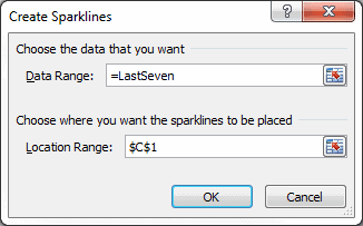
To visually see the last seven data points, I've added a Sparkline graphic at the top of my spreadsheet. Here are steps used in my example to create a sparkline graphic in cell C1.
- Select cell C1, or the range you want the sparkline to go
- Select the Insert menu, then above Sparklines click Line
- In the Data Range box, enter =LastSeven (don't forget the (=) equals sign)
- The Location Range box should have the correct cell address, if not select it now.
- Click OK
Here's what I got in cell C1 by doing all of that.

It's a bit non-descriptive, so we'll make some enhancements.
Make Changes to a Sparkline Graphic
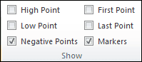
By selecting a sparkline cell, a new Excel menu appears on the ribbon: Sparkline Tools. To modify the sparkline in our example, select Sparkline Tools, then above Show, select Markers and Negative Points.
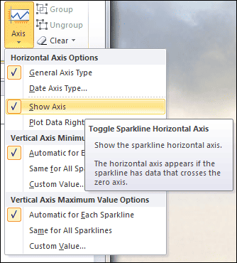
Above Group, click Axis then select Show Axis.
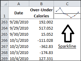
Now the sparkline shows markers at each data point and all points below the axis line are red. That's about as snappy as it gets. Below you can see the sparkline graphic beside the data range it represents, B263:B269.
Now that I've set up a sparkline graphic with a dynamic range, each time I add data the sparkline graphic automatically updates.
Bonus Formulas
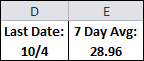 The very top picture in this post has two cells, D1 and E1, that represents an evolution from a previous post. I've combined a text heading with a formula that's inside a TEXT Function for formatting purposes. Above you can see the sparkline graphic with the data range it represents in column B. The information is self-explanatory. Here are the formulas:
- D1 ="Last Date: " &TEXT(OFFSET(A1,COUNTA(A:A)-1,0),"m/d")
- E1 ="7 Day Avg: " &TEXT(AVERAGE(OFFSET(B1,COUNTA(B:B)-7,0,7)),"#.00")
And of course, I'll substitute my named range to make the second formula more readable.
- E1 ="7 Day Avg: " &TEXT(AVERAGE(LastSeven),"#.00")