Pivot Charts can help you to take an unorganized set of data and turn it into a clear and concise representation of the information that you’re trying to convey. You can eliminate all unnecessary information and single out key data points in order to better understand specific subcategories of data.
What are Pivot Charts?

Pivot Charts offer a visual representation of relevant data from a set. Most often, charts get data points from associated Pivot Tables instead of from raw data. Pivot Charts give you more flexibility than tables when it comes to layout and aesthetics, however.
You can display information using categories, markers, axes, and other hallmarks of charts and graphs. Excel’s Pivot Chart tool lets you show off data in just about any format except for an XY (scatter plot), stock graph, or bubble chart.
The Difference Between Pivot Charts and Standard Charts
In most respects, Pivot Charts are similar to standard graphs. They help us to visualize data in a way that’s clear, concise, and easy-to-read using simple shapes and labeled markers.
There are, however, some slight differences when creating Pivot Charts that you should be aware of:
- The Orientation of Rows and Columns: With traditional charts, you can easily switch row and column orientation by using the Select Data Source dialog box. With Pivot Charts, however, you can click and drag to “pivot” row and column labels.
- Stylistic Limitations: As previously mentioned, you can’t make Pivot Charts in certain standard chart formats, including scatter plots, stock graphs, and bubble charts.
- Linked Data Sources: With traditional charts and graphs in Excel, you typically use data directly from worksheet cells. Pivot Charts, however, use information from Pivot Tables to create a simple and user-friendly graph.
- Changing Data: You can’t change the chart data range that you use in a Pivot Chart by using the traditional Select Data Source dialog box. Instead, you need to alter the associated Pivot Table.
- Editing formatting: When you refresh a Pivot Chart, layout and style stays the same. Elements such as trendlines, data labels, error bars, and other changes to data sets, however, may be lost.
If you usually deal with standard charts in Excel, then Pivot Charts may take some getting used to. As long as you know what you’re doing, though, making a Pivot Chart takes just minutes.
The Benefits of Pivot Charts
Pivot charts are more than just a colorful way to represent important data. There are a number of reasons to make the switch from standard tables to Pivot Charts when presenting data. If you’re trying to glean information from select cells in your data set, using a Pivot Chart is often less time-consuming. It allows you to eliminate any unwanted categories in one swoop instead of forcing you to go through and highlight individual cells. This also reduces the chance of human error messing up your numbers.
When making a Pivot Chart, the information that you use will come from a Pivot Table. If you need to alter any of the data points in your table, you’ll find that your graph updates automatically, making it easy to tinker with numbers and make quick fixes when necessary. This can also help to save you time and frustration over standard charts.
How to Create a Pivot Chart using a Pivot Table
To make a Pivot Chart, it’s easiest first to create a Pivot Table. A Pivot Table helps to summarize data from a large set into a smaller table that contains just the essential information.
You can use data from an Excel worksheet as the basis for a PivotTable, or you can import data sets from external sources such as a software database, an Online Analytical Processing (OLAP) cube, or a text file. You can even base a new Pivot Table on an existing file.
Once you’ve created a Pivot Table either manually or using Excel’s Recommended Pivot Table tool, you can use that information to make a Pivot Chart. While both the table and the chart will contain the same data, they present it in different ways.
Often, graphical representations are easier to read, especially when it comes to spotting patterns.
Creating a Pivot Chart from an Existing Pivot Table is Easy.
In just a few easy steps, you can have a graph that’s ready to go for your next major meeting or presentation. Here’s how to create a Pivot Chart using a Pivot Table:
- Select a cell that’s within your Pivot Table range.
- Go to PivotTable Tools > Analyze > PivotChart
- Select the chart type you want from the options available and click OK.
- Format your Pivot Table to your liking using different fonts, colors, and styles.
If you don’t have a Pivot Table at the ready, there’s no need to worry. You can make a Pivot Table and a chart at the same time if you want. Excel’s Recommended Charts tool automatically draws up a Pivot Chart and an associated Pivot Table based on raw data.
You can also do this manually:
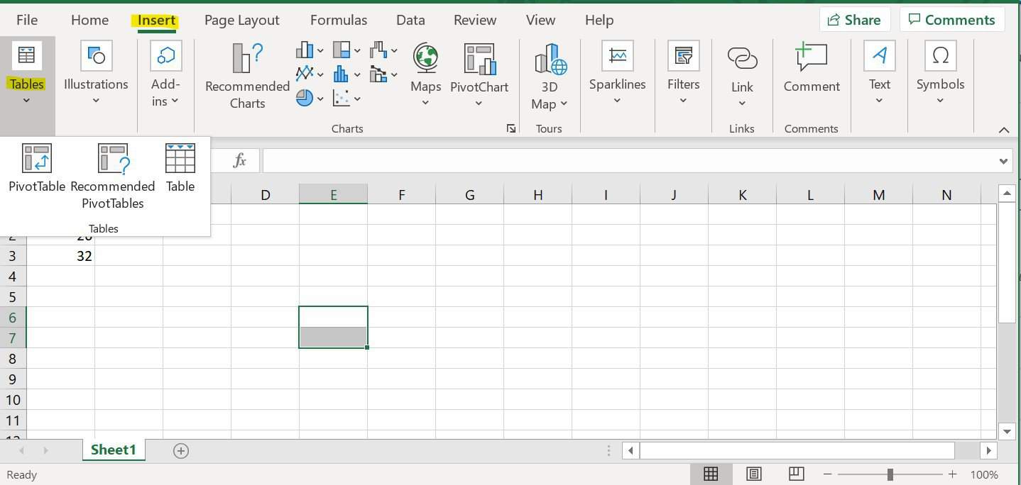
- Select a cell within your worksheet data.
- Go to Insert > Pivot Chart > Pivot Chart.
- In the dialog popup box, specify your data source and where you want your chart to be placed. You can also choose whether you want to analyze multiple tables.
- Press OK, and Excel will add a new worksheet with a blank Pivot Table and Pivot Chart. Go to the Field List to pick out which fields you want to include in your chart.
Conclusion
Pivot Charts can help you to understand complex data sets and make more informed decisions, both in business and in your personal life. By breaking down data, Pivot Charts allow you to better focus on the information that’s important to your enterprise.
By following the steps laid out in this tutorial, you can create attractive visual representations that are sure to get you noticed at your next presentation.